Monthly Archives: January 2014

Lise’s portrait

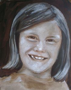
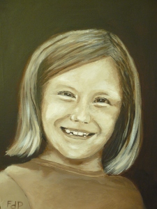
I spent the last week working on the final version of Lise’s portrait.  I did 2 studies of Lise on watercolour paper and finally decided to put it on canvas as a sepia painting.  Well, the final version took me more than a week to complete and I realized why portrait painting is so difficult.  There is a very fine line between light and dark and it is quite difficult to decide just when to stop working the painting and when the rounding and shading is good enough.  For a landscape painting I can exercise my artistic freedom, but for a portrait the painting must look exactly like the person.  The painter therefore has limited freedom of expression.  Colour may change, but contour, shape and shading must all stay realistic and true to your model.

Anyway, the final version is presented below.  I think I managed OK for my first portrait.  It feels a little too “white”, but the real painting has character and is a good representation of Lise.  I will probably do portraits again, but will move on to something else for now.  Portraits are a lot of work.

Final portrait of Lise (acrylic on canvas)

Final portrait of Lise (acrylic on canvas)

Lise reference

A portrait study

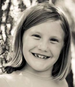
So my next painting was a portrait.  I can understand that this is where the pain in painting comes from.  It is so difficult getting it exactly right that it is really painful.  My model was one of my daughters.  I had a reference photo of her (presented below) which I used.  My objective was to do a couple of studies before I did the final painting.

Lise reference

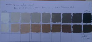
I wanted to do it in sepia, so I first did another colour study, presented below.  The first row was too grey, so I added more Burnt Sienna to get the second, warmer, row.  I used this row for the painting.

Sepia colour study.

Sepia colour study.

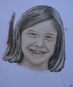
I make use of an iPad app called Camera Lucida to transfer the image onto the canvas.  This is similar to using a projector, but simpler.  Well for these studies I used my Winsor & Newton Galleria paints on 200 gsm watercolour paper which I stuck onto some hardboard.  The result of the first attempt is presented below.  I felt that it was a bit washed out and I did not really capture her likeness.  It is predominantly the eyes that are out of place.

Lise:  first study

Lise: first study

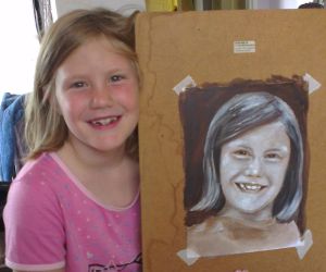
For the seconds study I changed 4 things.  I only used 5 values on the colour chart that I set up.  I enlarged the image to make it easier to paint.  I used Zinc White (called mixing white) instead of Titanium White to paint and I enlarged the eyes on purpose.  The mixing white is more transparent than the other one, making it more difficult to get a true white onto the canvas, but it also does not have a too dramatic impact on the canvas should you blot it down in the wrong spot.  I thought I could reduced the washed-out effect by using the mixing white. So, here is the result and another photo of her with the painting.  The zinc white turned out to be quite difficult to work with.  I wanted to insert some highlights from the sun and that it the reason for the white blots.  I feel like I still did not quite get her smile right and that the shape of her face need to be a little more rounded.  But, it was a good step forward in another aspect of the world of paint.  And off-course, Lise is really chuffed with all the attention that she is suddenly getting and that I keep on making paintings of her.

Lise

Lise

Lise with the painting


The Red Hills reworked

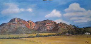
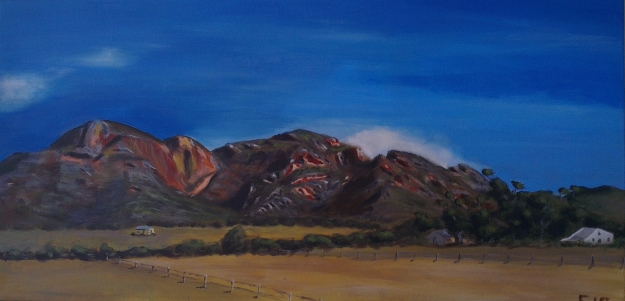
Something bothered me about the Red Hill painting that I did over the weekend.  I subsequently took the photo of the painting and worked it in my favorite iPad app ProCreate (something like Photoshop for the iPad) to see what the impact would be of some changes.  I wanted to change the clouds since they looked like grade 1 crayon clouds.  I also wanted to put a little focus on the middle head and was contemplating the removal of the little workers’ house to the left in the picture.  From ProCreate I saw that the change in the sky and the focus on the middle head will work, but my artistic adviser (my wife) wanted me to leave the little house in, so I followed her advise, especially since the painting will be hanging in our house.

And so I worked the sky until it worked and felt like the sky in the Little Karoo – fresh and bright blue in a way that you can only find in the Karoo.  I worked the middle head and put the focus on it in a satisfactory way until I knew that I had to stop and this is the result.  I tried to do something of a spotlights effect on the middle head, but I am not sure it worked.  I am still struggling with photographing my paintings, so the colour looks different from the previous painting.
2014-01-09 12.36.53

Something in this painting just works for me.  My favorite online art teacher (Richard Robinson) recently made the following statement in reaction to the question of “Why do we paint?”.  He said a lot of things, but then concluded with the comment: “One of my favorite moments is sitting back with a coffee and absorbing a freshly finished painting – seeing how my passion translated itself into paint. If the translation is garbled their is inevitably disappointment, but if the translation is true the coffee seems to taste extra good.”  This is where I am now.  It is 23:19 at night and I decided to stop painting.  I can still do a lot of things and say a lot of things about the painting.  The balance is probably not right and there is a discrepancy in the details in the left and middle head, but I decided that I am finished and that the painting says what I wanted it to say.  And now I can savor the coffee.  I sit in front of the painting and start up the left head to go and inspect the caves at the top and have an awesome view over the Little Karoo from the top of that big red head.  Then I venture down to inspect that lonely house and try to determine its story before I start up the rocky middle hill.  This one is mysterious with all the rocks, crevices and deep shadows.  I can see myself climbing between these while staring at the painting and climbing into it.  I finally walk over to the right hand head from where I look down on the farmyard and from where I can here the morning farm noises.   I see the trees and the dark shadows between the the trees.  The shadows and the house between the shadows look so real.  They look like they really look.  I sit and I look and and walk around some more on the farm and then I know that I feel satisfied and that the coffee is really tasting very good.

This was my first real landscape and my first panoramic.  I put a lot of effort into this painting and I was very technical in my approach to it.  I will probably paint it again and then I will change some things, for for now I feel really satisfied with the outcome and with those trees, oh those trees…
 

The Red Hills

For my latest painting I took on a topic which I knew was difficult:  I tried to do a proper landscape painting of a panoramic photo on a wide canvas.  I was quite excited since I recently bought new paint.  On the suggestion of a professional artist, I bought Winson and Newton’s Galleria series of artist quality acrylic paints.  The artist (Diane McLean from De Rust) suggested that the better quality paints should give my painting the better colour quality that I am looking for.  So, I was looking forward to using my new paints on this very ambitious project.

While on holiday in the Little Karoo in the town of De Rust (near Oudtshoorn in the Western Cape), I took a series of panoramic photos of the well-known red hills in the area.  My plan was to a create some panoramic paintings from these photos.  The photo that I used for my painting is presented here.

Red Hills reference photo

Red Hills reference photo


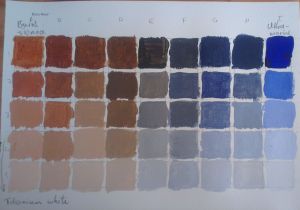
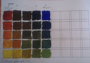
The big challenge was to get the balance right between light and dark and details versus vagueness.  Since I was working with new paints, I followed the advise of my online art teacher Richard Robinson by using a limited palette and first creating a colour chart.  I used Raw Sienna and Ultramarine as the primary colours and used white (both Titanium white and mixing white) and light yellow to reduce the darkness in the colour.  Off course, the yellow also brings green into the picture and this green is a better green than my tubegreen (Phthalo green).  The colour charts are presented below.

Raw sienna - ultramarine - white colour chart

Raw sienna – ultramarine – white colour chart


Raw sienna – ultramarine -yellow colour chart


The colour charts turned out to be crucial for this project since I could simply refer to the chart to determine what colour I needed to mix and how I needed to mix it.  I spent 16 hours finishing this painting and result is presented below.  I am satisfied with the painting.  The clouds could get some more attention and I would like to do something with the field in the foreground, but I decided to leave it as is.  To me it was a real accomplishment to be able to express the level of realism that I have managed to do.

The Red Hills

The Red Hills

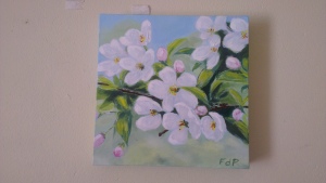
Blossoms

My wife asked me to do a painting for her on blossoms.  It is a small 25cmx25cm canvas. I took it on, but soon realized that this is not an easy topic to paint.  The extreme “whiteness” in the photo resulted in low contrast with the result that the painting can easily look washed out.  I tried my best, but could not quite manage the expression that I was aiming for.  Adding the dark shades did bring out some dimension in the painting, but the flowers look flat and washed out.  It is probably the reference photo rather than the topic that caused me so much trouble.  Anyway, here is the photo of the finished painting.  As always, I will welcome any comments.

I am struggling to get a good photo of this one.

Blossoms

Blossoms