Tag Archives: Richard Robinson

Value-based study and tutorial

This image below is a simple picture drawn using 9 values of the same colour. I wanted to show how easy it is to obtain atmospheric perspective by just painting using colour values. I completed a video tutorial on this topic mostly for application to digital art, which is here. Make sure you watch the totorial in HD. As indicated by Richard Robinson, the value-based painting concept is the key to successful oil painting as well. I do all my digital and oil paintings using the value-based colour concept. I bought his Mastering Colour course and it unlocked all the secrets of effective colour use and the value-based painting strategy to me.

A family affair

My eldest daughter, Anneli, is really good with drawing people.  You can see some of her artwork on her Pinterest board.  This morning we had some time at hand and I came across the idea of doing a joint painting/sketch.  I have seen joint paintings before where Joseph Zbukvic, Alvaro Castagnet and Herman Pekel were jointly working on a painting.  The link is here.  So, we decided to give it a try.  We found some colourful images of people and a good mountain  picture on Pinterest and started to combine them into a painting.  I would be doing the mountain and sky and she would be doing the detail of the grass and the people… I am not good with detail.  We worked on a 190 gsm A2 sheet.  I used large flat brushes with Windsor and Newton Cotman watercolours and she used a number 1 brush with the watercolour and some Derwent Academy Watercolour Pencils.  The result can be seen below.  I really like it. It feels like the people and the valley just gel!  I can see myself staring down that valley to wonder what is down there and hear the wind softly blowing around me.

One of my favourite art teachers, Richard Robinson, once made the following comment: “… One of my favorite moments is sitting back with a coffee and absorbing a freshly finished painting – seeing how my passion translated itself into paint. If the translation is garbled their is inevitably disappointment, but if the translation is true the coffee seems to taste extra good.”  …. and I must say, BOY, DID THAT COFFEE TASTE GOOD!!!!!

The valley

The valley

Early morning

For the last couple of weeks I have been busy with a commissioned work based on the Red Hills (refer to my previous post listed here) near De Rust in the Western Cape. My plan was to do the same painting with better sky and clouds and a better composition of the mountains. I am busy working through a course of Johannes Vloothuis entitled The Essentials of Painting Mountains and I incorporated what I learned form this course into the painting. But, as I was busy with the landscape I suddenly realized that the hills are quite dark and when I added colour to the hills, that it looks like sunshine hitting it straight on. So the painting turned out as shown below. Rather unexpected, but quite nice. When looking at the painting I get the feeling of being in the Little Karoo early in the morning. I can hear the farm and the sounds through the early morning air. The air is quite chilly and just at that moment the sun breaks the horizon and hits the top of the hills. I feel like I can walk around in this painting and really be there.

The things that works in this painting are the sky, the clouds (to some degree) and the composition of the hill within the photo. I also managed in incorporate some interesting features into the field at the bottom center of the painting. As I look at the painting and sit back to savor my coffee, it tastes really good. The outcome was different to what I expected, but quite satisfying.

I encourage you to click on the image to see a larger version of the painting. The colour is better in the bigger image.

Early morning on the red hills

Early morning on the red hills

The Red Hills reworked

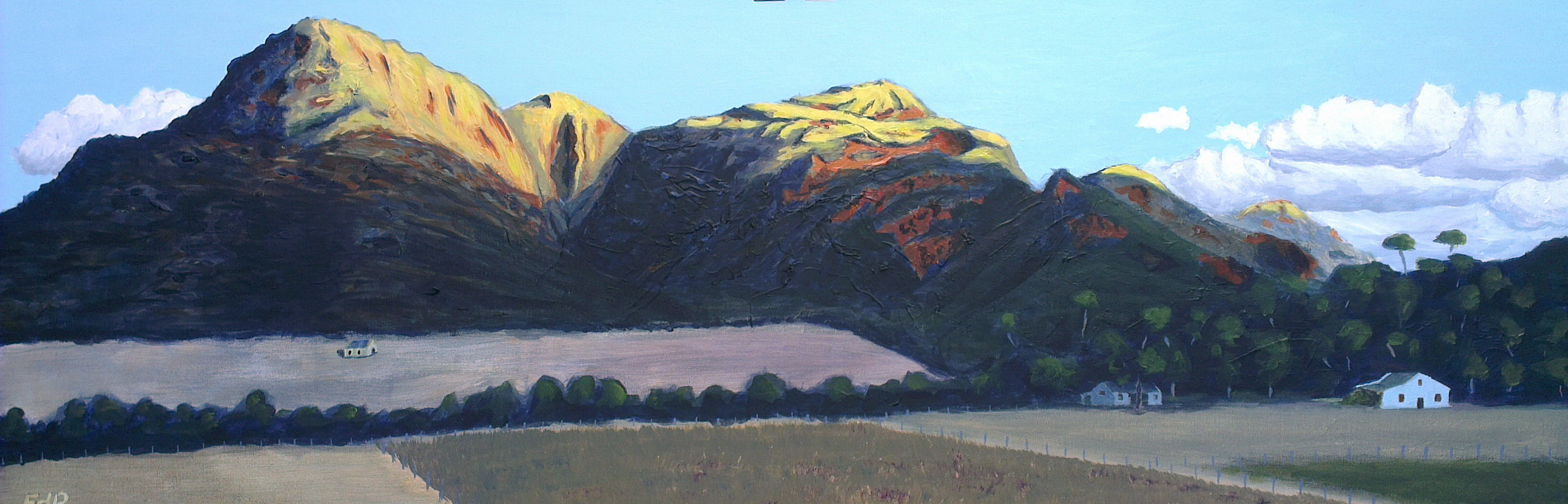
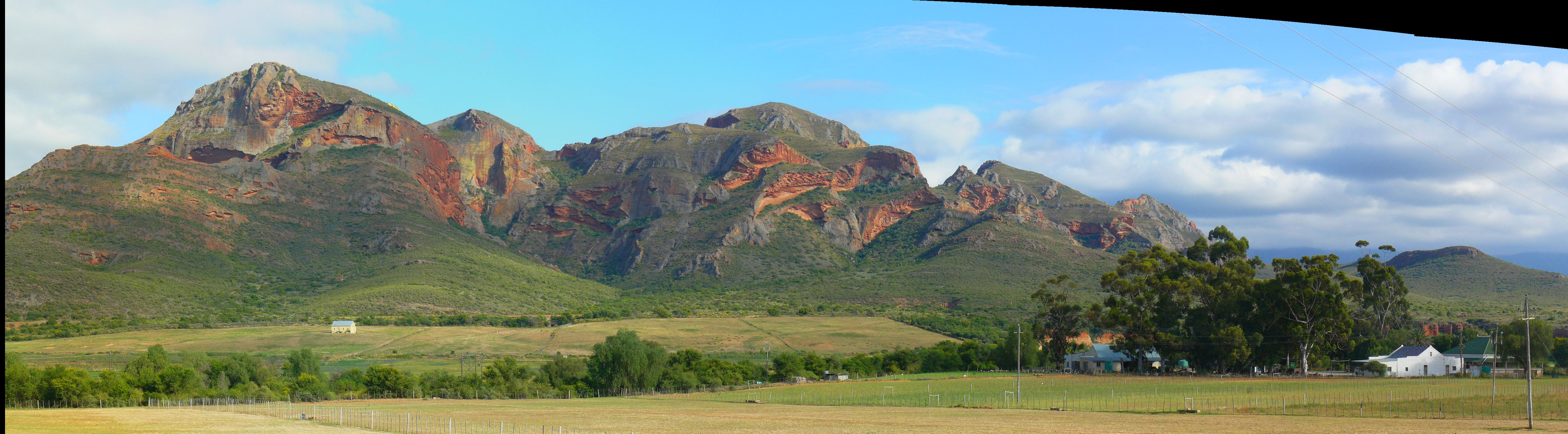
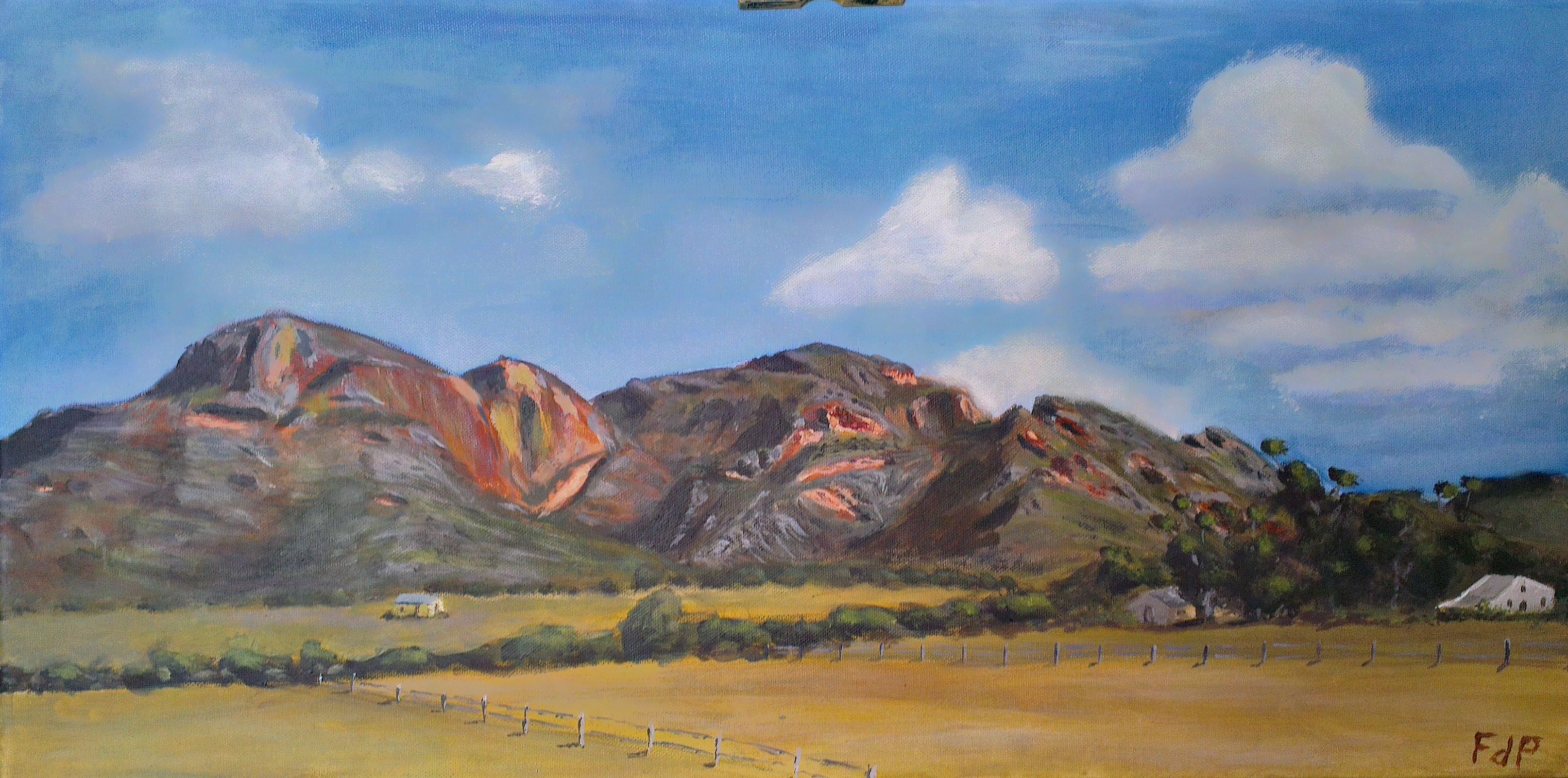
Something bothered me about the Red Hill painting that I did over the weekend.  I subsequently took the photo of the painting and worked it in my favorite iPad app ProCreate (something like Photoshop for the iPad) to see what the impact would be of some changes.  I wanted to change the clouds since they looked like grade 1 crayon clouds.  I also wanted to put a little focus on the middle head and was contemplating the removal of the little workers’ house to the left in the picture.  From ProCreate I saw that the change in the sky and the focus on the middle head will work, but my artistic adviser (my wife) wanted me to leave the little house in, so I followed her advise, especially since the painting will be hanging in our house.

And so I worked the sky until it worked and felt like the sky in the Little Karoo – fresh and bright blue in a way that you can only find in the Karoo.  I worked the middle head and put the focus on it in a satisfactory way until I knew that I had to stop and this is the result.  I tried to do something of a spotlights effect on the middle head, but I am not sure it worked.  I am still struggling with photographing my paintings, so the colour looks different from the previous painting.

2014-01-09 12.36.53

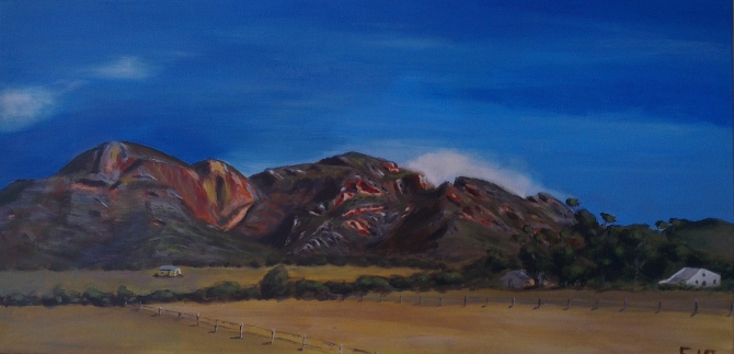
Something in this painting just works for me.  My favorite online art teacher (Richard Robinson) recently made the following statement in reaction to the question of “Why do we paint?”.  He said a lot of things, but then concluded with the comment: “One of my favorite moments is sitting back with a coffee and absorbing a freshly finished painting – seeing how my passion translated itself into paint. If the translation is garbled their is inevitably disappointment, but if the translation is true the coffee seems to taste extra good.”  This is where I am now.  It is 23:19 at night and I decided to stop painting.  I can still do a lot of things and say a lot of things about the painting.  The balance is probably not right and there is a discrepancy in the details in the left and middle head, but I decided that I am finished and that the painting says what I wanted it to say.  And now I can savor the coffee.  I sit in front of the painting and start up the left head to go and inspect the caves at the top and have an awesome view over the Little Karoo from the top of that big red head.  Then I venture down to inspect that lonely house and try to determine its story before I start up the rocky middle hill.  This one is mysterious with all the rocks, crevices and deep shadows.  I can see myself climbing between these while staring at the painting and climbing into it.  I finally walk over to the right hand head from where I look down on the farmyard and from where I can here the morning farm noises.   I see the trees and the dark shadows between the the trees.  The shadows and the house between the shadows look so real.  They look like they really look.  I sit and I look and and walk around some more on the farm and then I know that I feel satisfied and that the coffee is really tasting very good.

This was my first real landscape and my first panoramic.  I put a lot of effort into this painting and I was very technical in my approach to it.  I will probably paint it again and then I will change some things, for for now I feel really satisfied with the outcome and with those trees, oh those trees…


The Red Hills

For my latest painting I took on a topic which I knew was difficult:  I tried to do a proper landscape painting of a panoramic photo on a wide canvas.  I was quite excited since I recently bought new paint.  On the suggestion of a professional artist, I bought Winson and Newton’s Galleria series of artist quality acrylic paints.  The artist (Diane McLean from De Rust) suggested that the better quality paints should give my painting the better colour quality that I am looking for.  So, I was looking forward to using my new paints on this very ambitious project.

While on holiday in the Little Karoo in the town of De Rust (near Oudtshoorn in the Western Cape), I took a series of panoramic photos of the well-known red hills in the area.  My plan was to a create some panoramic paintings from these photos.  The photo that I used for my painting is presented here.

Red Hills reference photo

Red Hills reference photo


The big challenge was to get the balance right between light and dark and details versus vagueness.  Since I was working with new paints, I followed the advise of my online art teacher Richard Robinson by using a limited palette and first creating a colour chart.  I used Raw Sienna and Ultramarine as the primary colours and used white (both Titanium white and mixing white) and light yellow to reduce the darkness in the colour.  Off course, the yellow also brings green into the picture and this green is a better green than my tubegreen (Phthalo green).  The colour charts are presented below.

Raw sienna - ultramarine - white colour chart

Raw sienna – ultramarine – white colour chart


Raw sienna – ultramarine -yellow colour chart


The colour charts turned out to be crucial for this project since I could simply refer to the chart to determine what colour I needed to mix and how I needed to mix it.  I spent 16 hours finishing this painting and result is presented below.  I am satisfied with the painting.  The clouds could get some more attention and I would like to do something with the field in the foreground, but I decided to leave it as is.  To me it was a real accomplishment to be able to express the level of realism that I have managed to do.

The Red Hills

The Red Hills

The boat – a study in a limited pallette

One of the aspects highlighted in the Colour Course by Richard Robinson is the proper use of colour and the utilization of a limited palette consisting of complementary colours.  I decided to do a study in a limited palette and the result was one of my most satisfactory paintings to date.  It was done on a small 8″ x 11″ hardboard and I will definitely consider putting this on a proper canvas.

I made use of yellow ocre and ultramarine as the base colours with a little titanium white being used in places.  The aim of the study was to see that, if two complementary colours (the yellow ocre and the ultramarine) are added, a greyish colour is obtained.  Adding more of the dark colour will push this grey towards the lower (darker) values and adding more of the lighter colour (the ocre) will push it towards the higher (lighter) values.  It was difficult sticking to the strict value scales while experimenting with the limited palette, but I did explicitly plan towards specific values as spread through the painting.

The boat in colour.

The boar in grey-scale.


This was the first painting that I did that I felt was really lifelike, even if being done with a limited palette.  The values feel strong (as supported by the grey-scale version of the photo) and the lights feel really life-like.  The photo does not tell the true story since the colour is washed out in the photo, but something in this story “just works”.  I think it is the movement in the water and the light on the rope that is making the painting believable.

I start to get the impression that I am better at painting “dead things” than “living things”.

Venturing into tone, value and colour

I recently came across some of the excellent courses of Richard Robinson (http://www.livepaintinglessons.com/) on landscape painting and while viewing his “Landscape Masterclass” course, realized that there are some components of this course that I did not understand. I subsequently bought his course “Mastering Color” (“color” being spelled wrong, off course…) and have been working through that for the last 2 weeks. It addresses all aspects of colour, tone and value and is highly recommended for anyone interested in taking their painting a step further. The essence of the course lies in the principle that just putting colours together could result in a good picture with a realistic appearance, but that the true quality of the painting will lie in the correct use of value – the dark and light components in an image. It is much more complex, but a simplified first step suggested by Robinson is to make use of a value-scale such as presented below to judge the values in a painting and then only make use of those values (the discrete colours) while painting. One can think of it as converting a photograph of your painting to gray-scale and evaluating that to determine the values in the painting. A good painting with inherent value should then still make sense (have meaning) with the colours reduced to grey-scales.

Greyscale

As first pass, I tried to paint the following grey-scale photo using the grey value-scale.

Reference photo for grey value-scale study of the sheep.

Reference photo for grey value-scale study of the sheep.

I did this study in very poor light since we were in De Rust in December with temperatures of around 40 degrees Celsius. The poor lighting resulted from me working inside with drawn curtains. I tried to work on a couple of things with the two main aspects being the use of the 9 values on the value-scale and trying to paint realistic grass. The painting below presents my efforts. I did not work too much on the realism of the sheep, but I do feel that the shadows are realistic, the use of the value-scale was accomplished to some degree and finally that the grass were painted with a high level of realism. I realized that the grasses must be painted with at least 3 but maybe even with 4 values of grey.  The darkest value represents the roots and the lightest value the highlights of the sun on the grasses.

Flock of sheep greyscale study.

Flock of sheep greyscale study.

The photo of my painting was taken in the evening, so it does not really reflect the true painting. A great study in the end and one through which much was learned. One of the most important lessons learned was the value contained in performing a study.