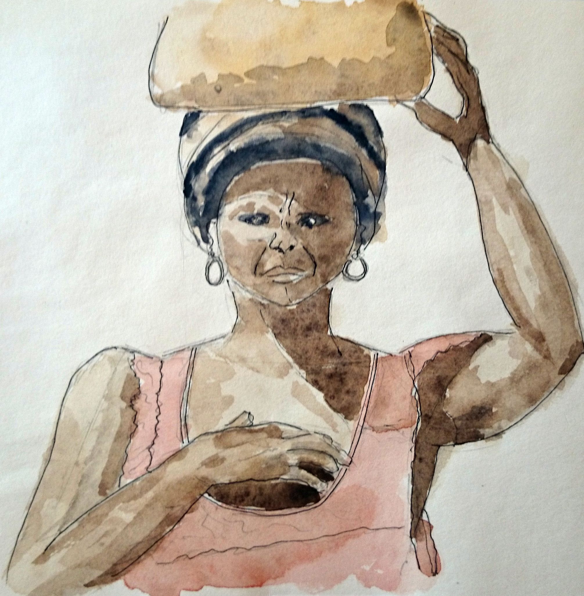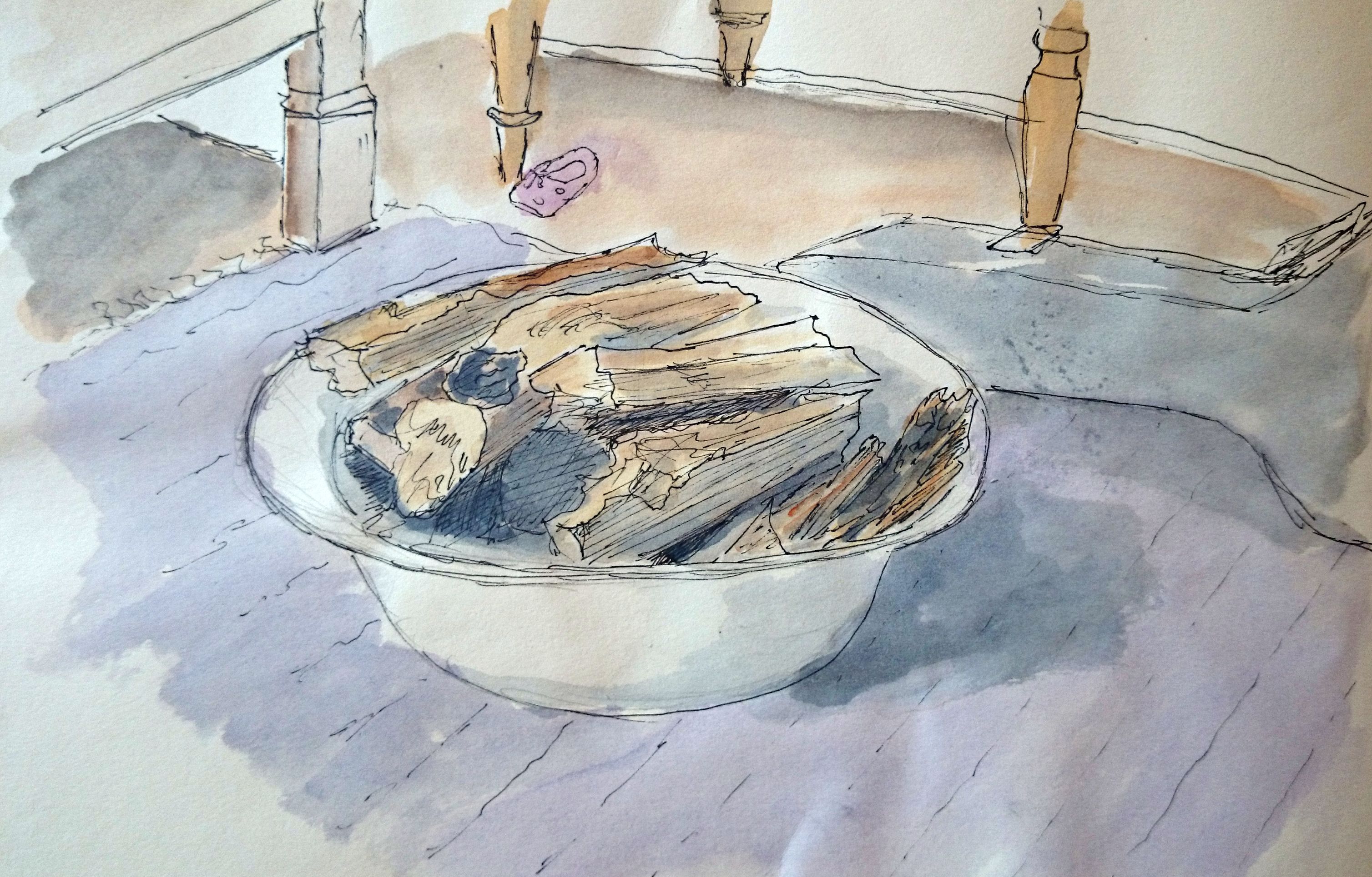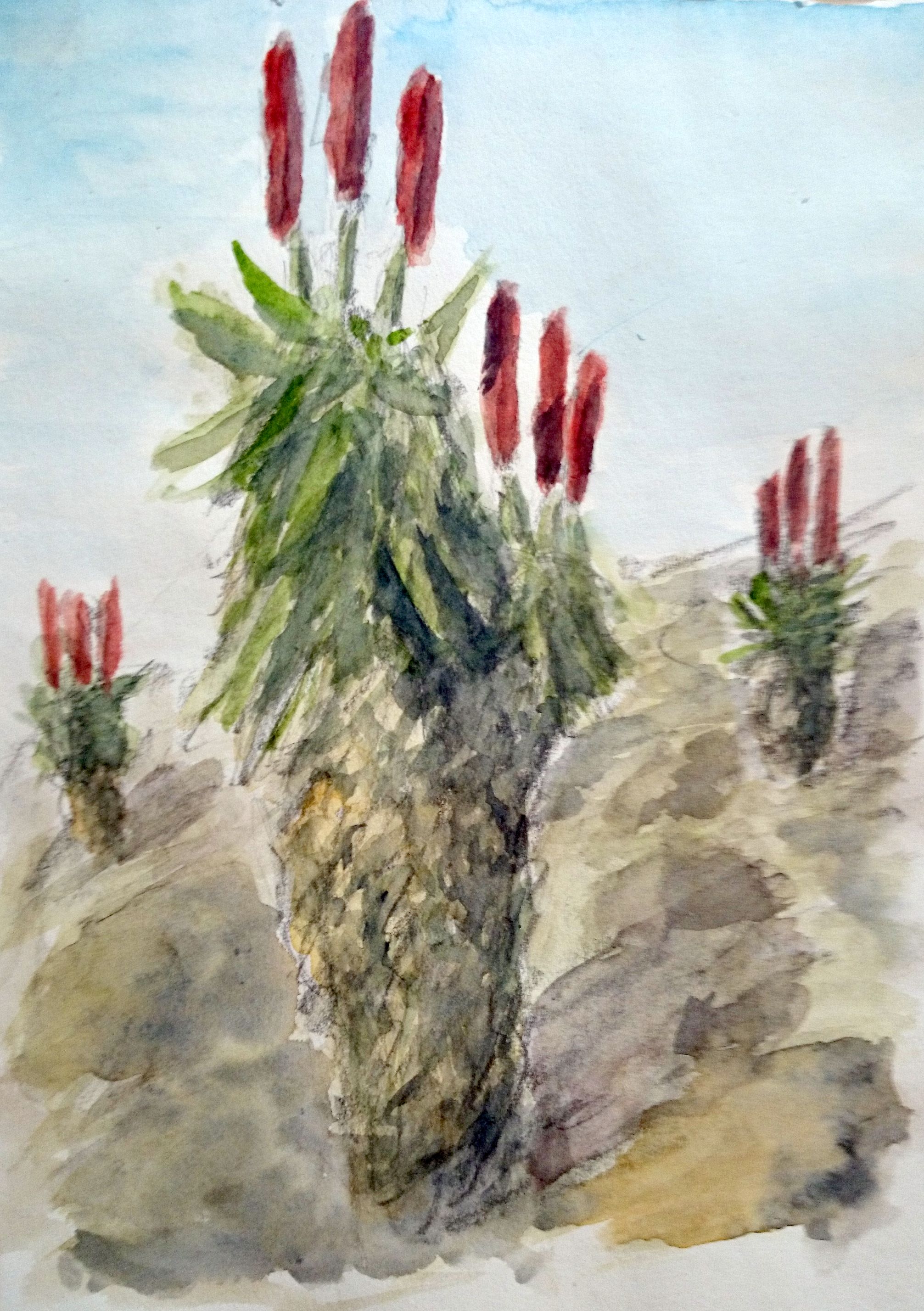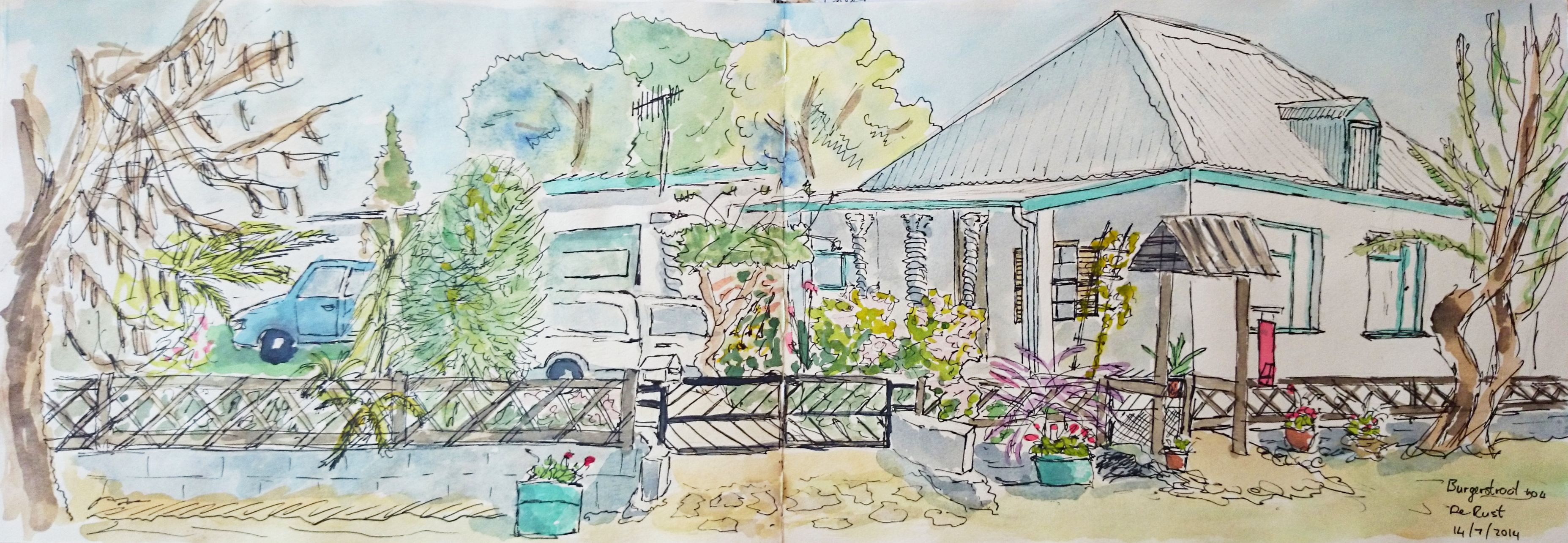
My grandmother was an art teacher and I was fortunate enough to get some of her equipment. One thing that I inherited was a set of dip pens originating from the 1920’s. Well, I came across them recently and decided to see how they would combine with watercolour paint. The results are presented below. I used Windsor & Newton Sepia Calligraphy permanent ink in combination with my Windsor & Newton Cotman watercolours. I found that the earth colours combine really well with the sepia ink.
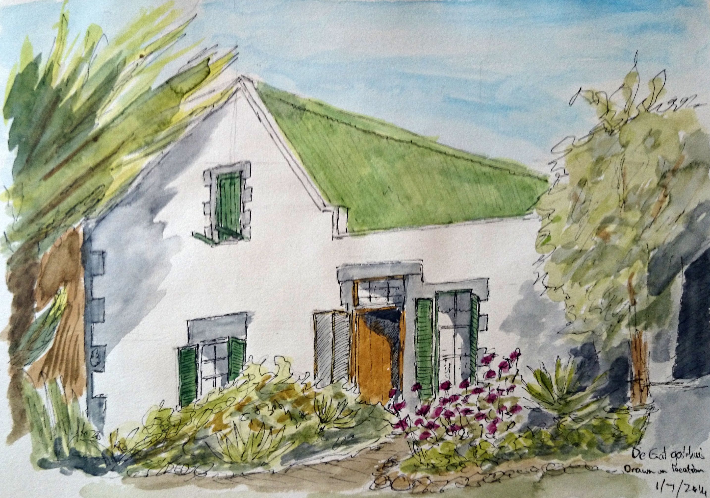
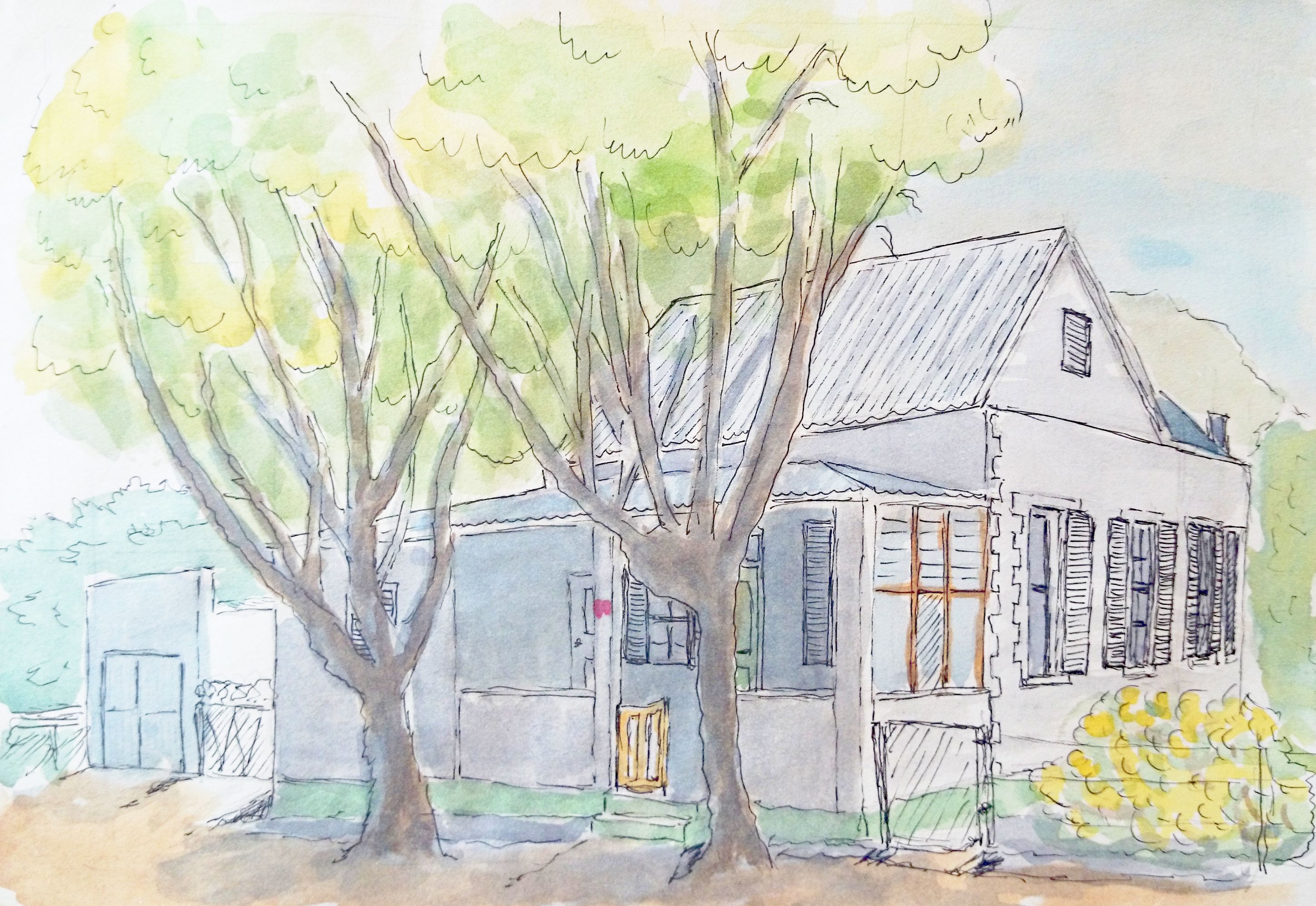
The first sketch his based on an photo I found in a British magazine. The second sketch was about 80% improvised and could be a representation of the shack from the book The Shack by William Paul Young. I have never been comfortable with improvisation, so this was a breakthrough for me. I like the different values of green that I obtained by tinting the light green with an ultramarine blue. I used Payne’s Grey in some places for the shadows under the trees and for the porch.
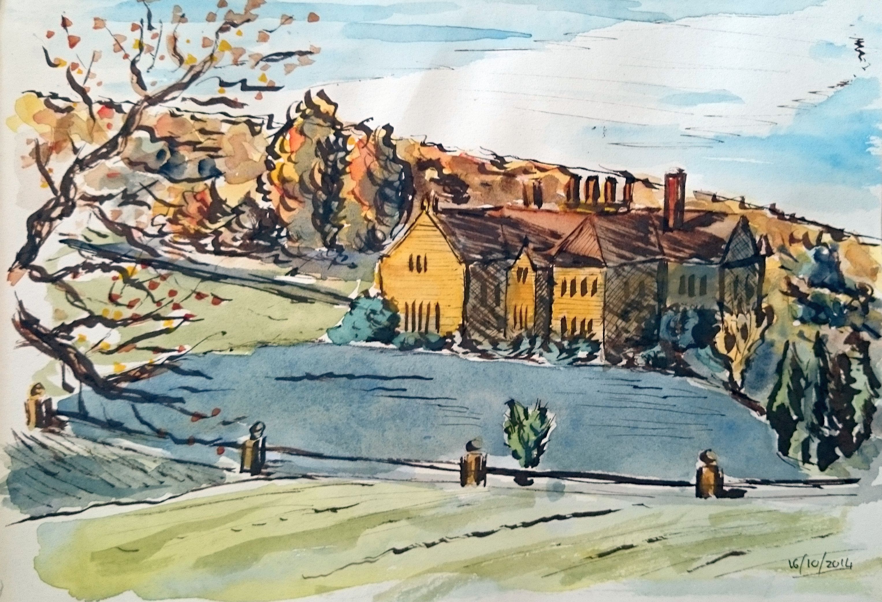
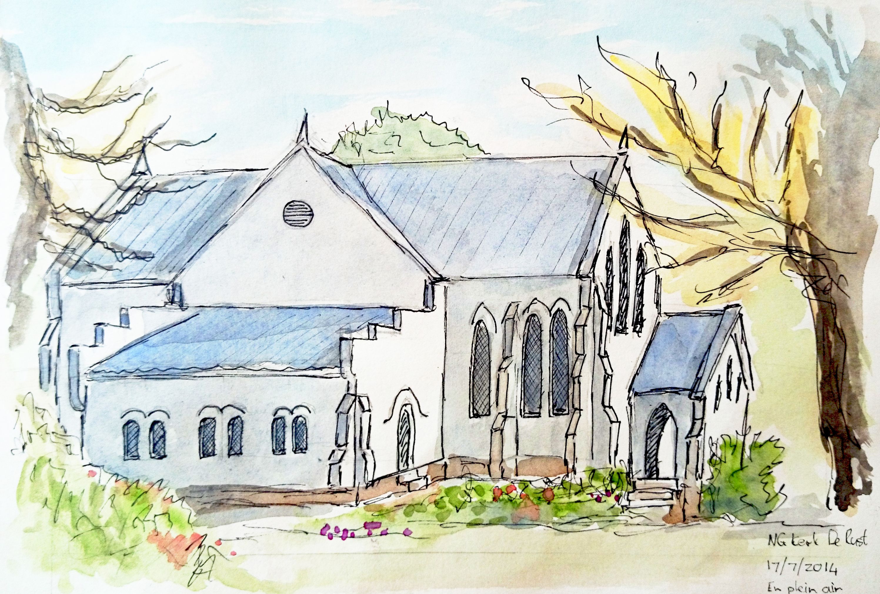
An English mansion.
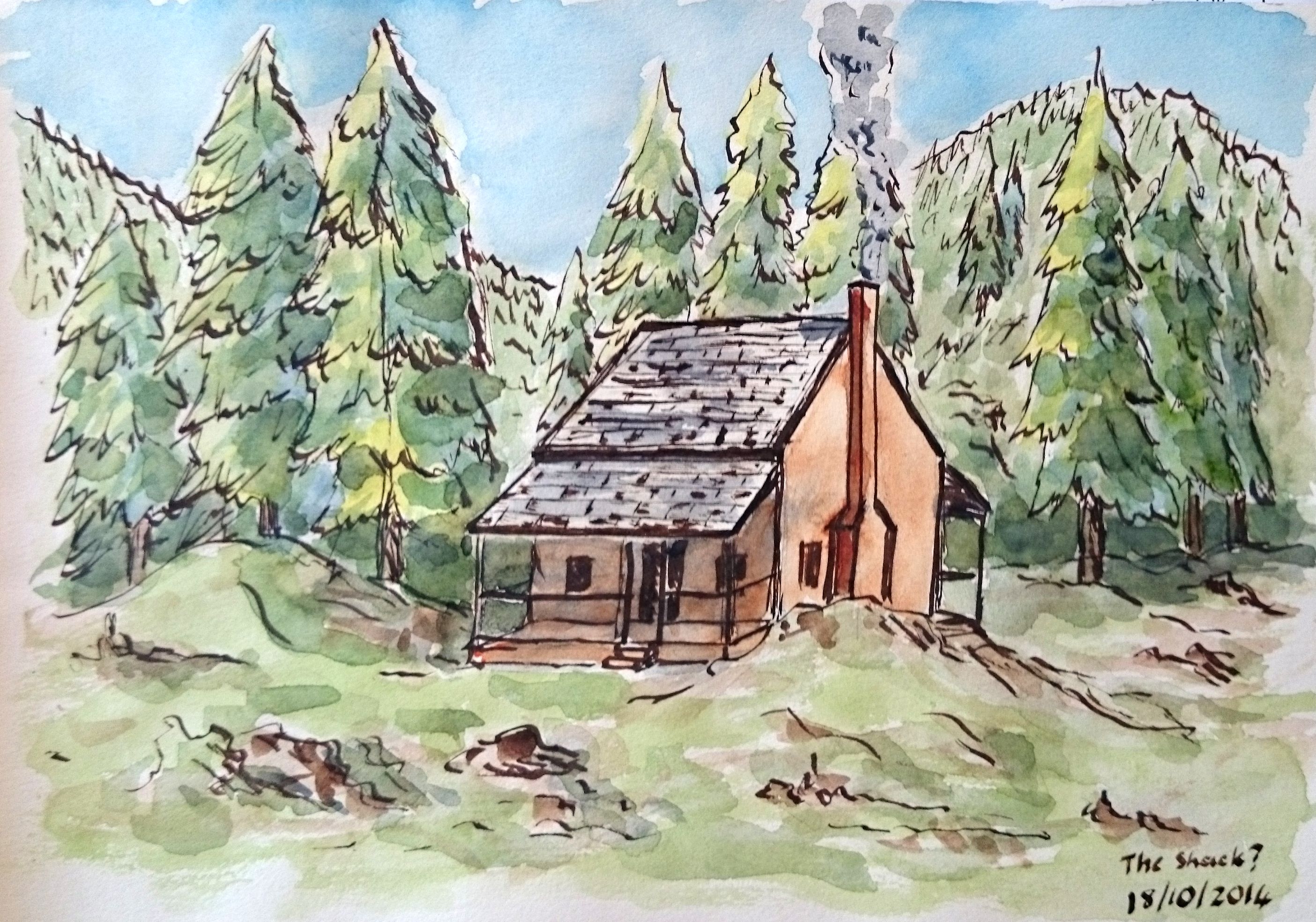
The Shack.