Monthly Archives: December 2013

The boat – a study in a limited pallette

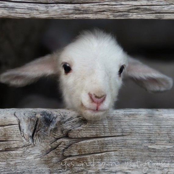
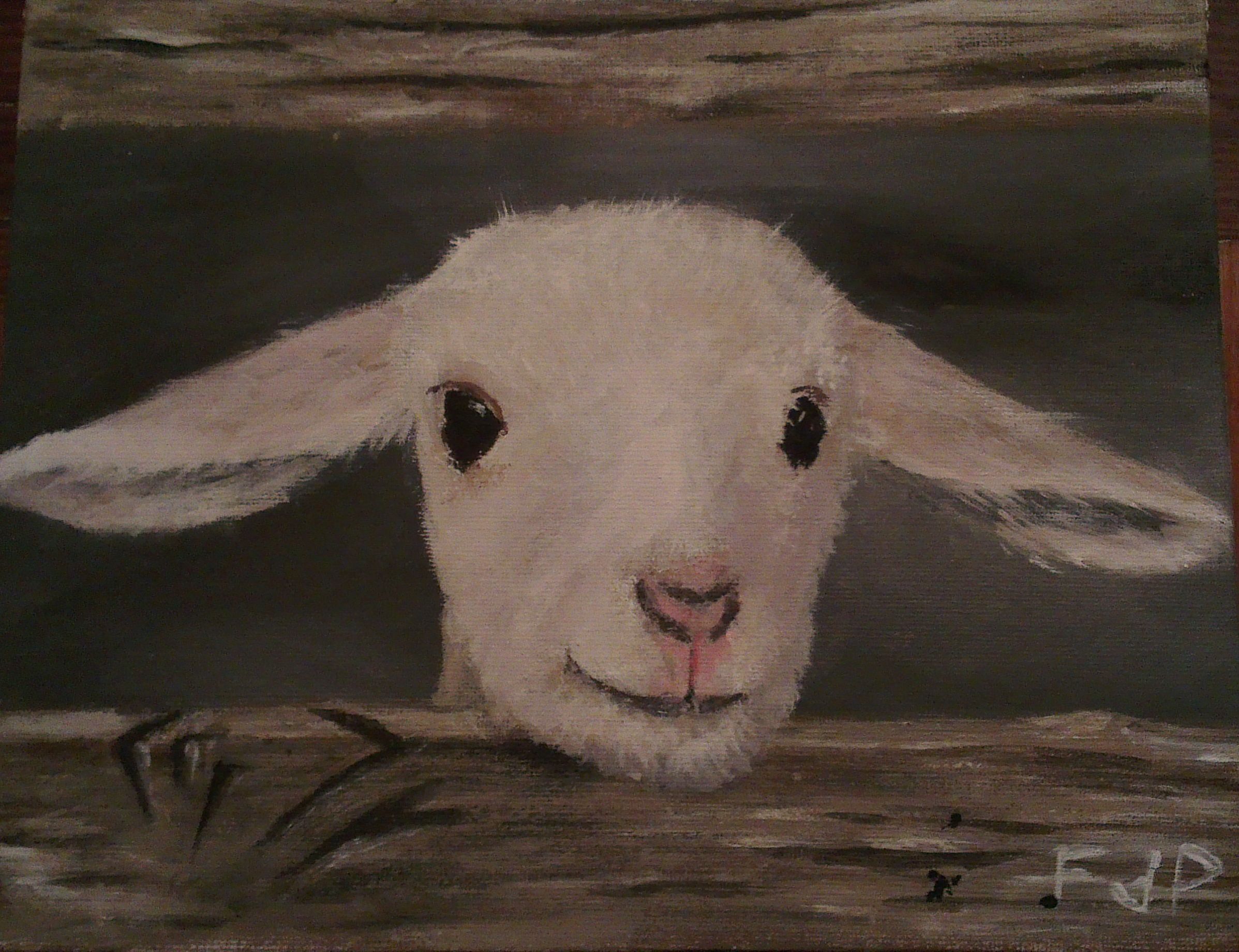
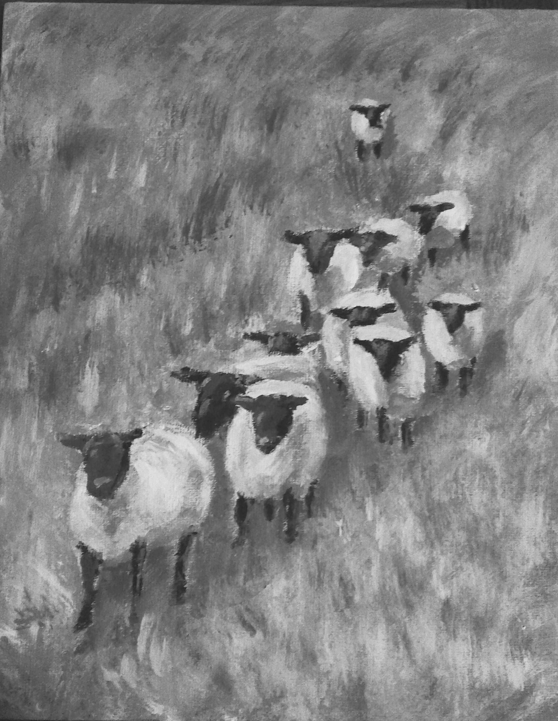
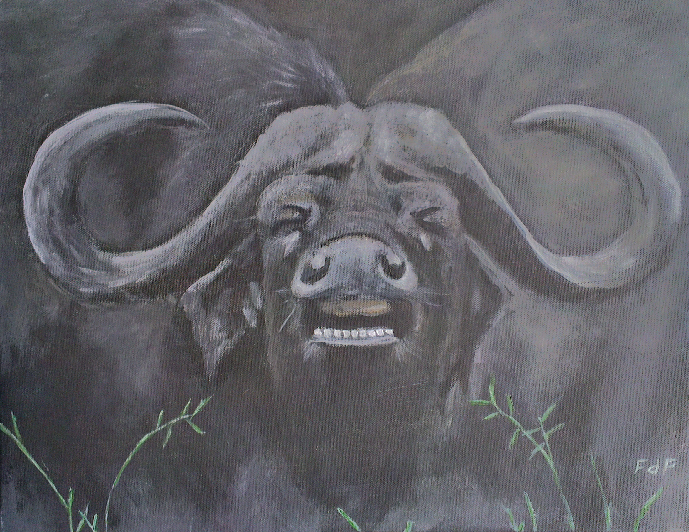
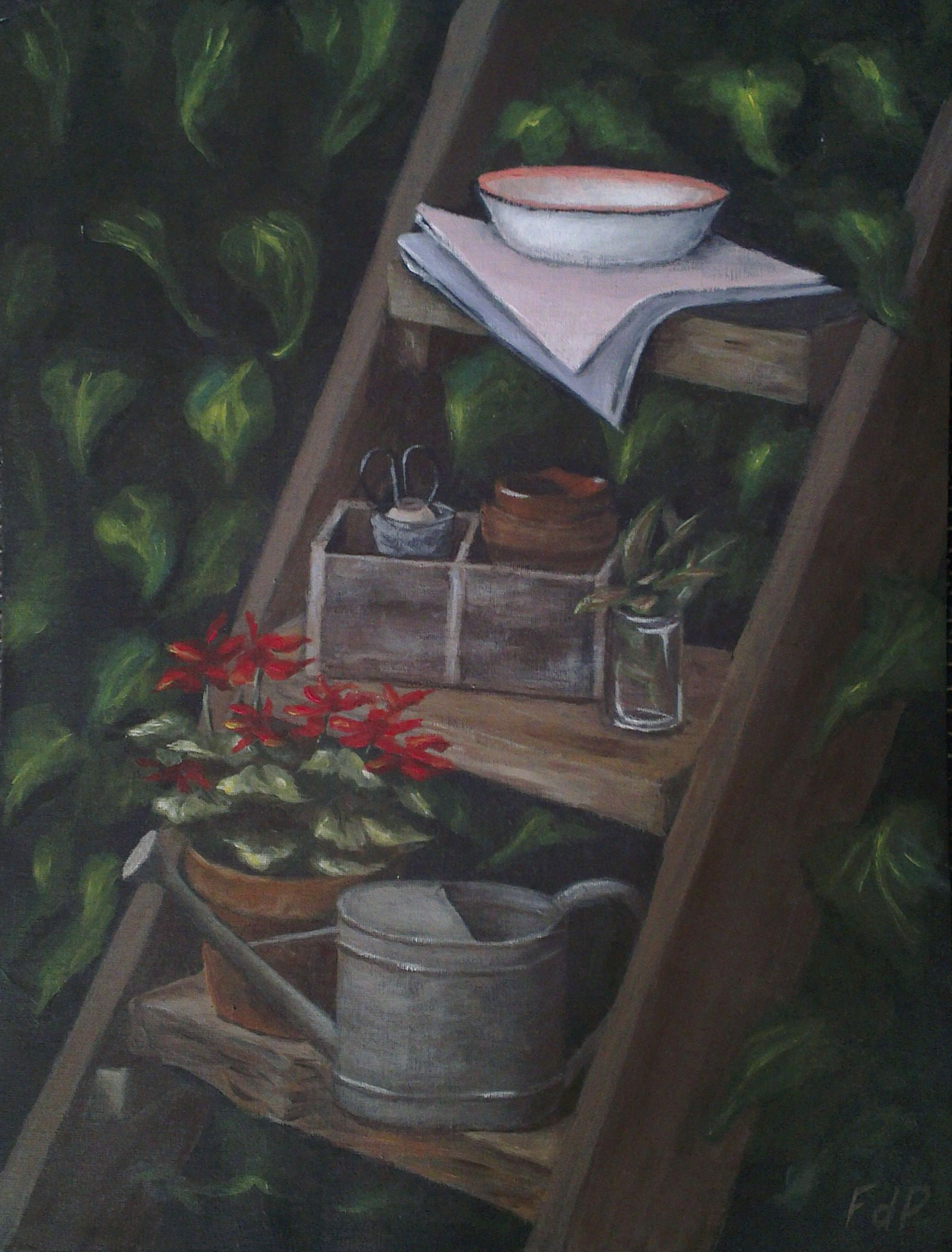
One of the aspects highlighted in the Colour Course by Richard Robinson is the proper use of colour and the utilization of a limited palette consisting of complementary colours.  I decided to do a study in a limited palette and the result was one of my most satisfactory paintings to date.  It was done on a small 8″ x 11″ hardboard and I will definitely consider putting this on a proper canvas.

I made use of yellow ocre and ultramarine as the base colours with a little titanium white being used in places.  The aim of the study was to see that, if two complementary colours (the yellow ocre and the ultramarine) are added, a greyish colour is obtained.  Adding more of the dark colour will push this grey towards the lower (darker) values and adding more of the lighter colour (the ocre) will push it towards the higher (lighter) values.  It was difficult sticking to the strict value scales while experimenting with the limited palette, but I did explicitly plan towards specific values as spread through the painting.

The boat in colour.

The boar in grey-scale.


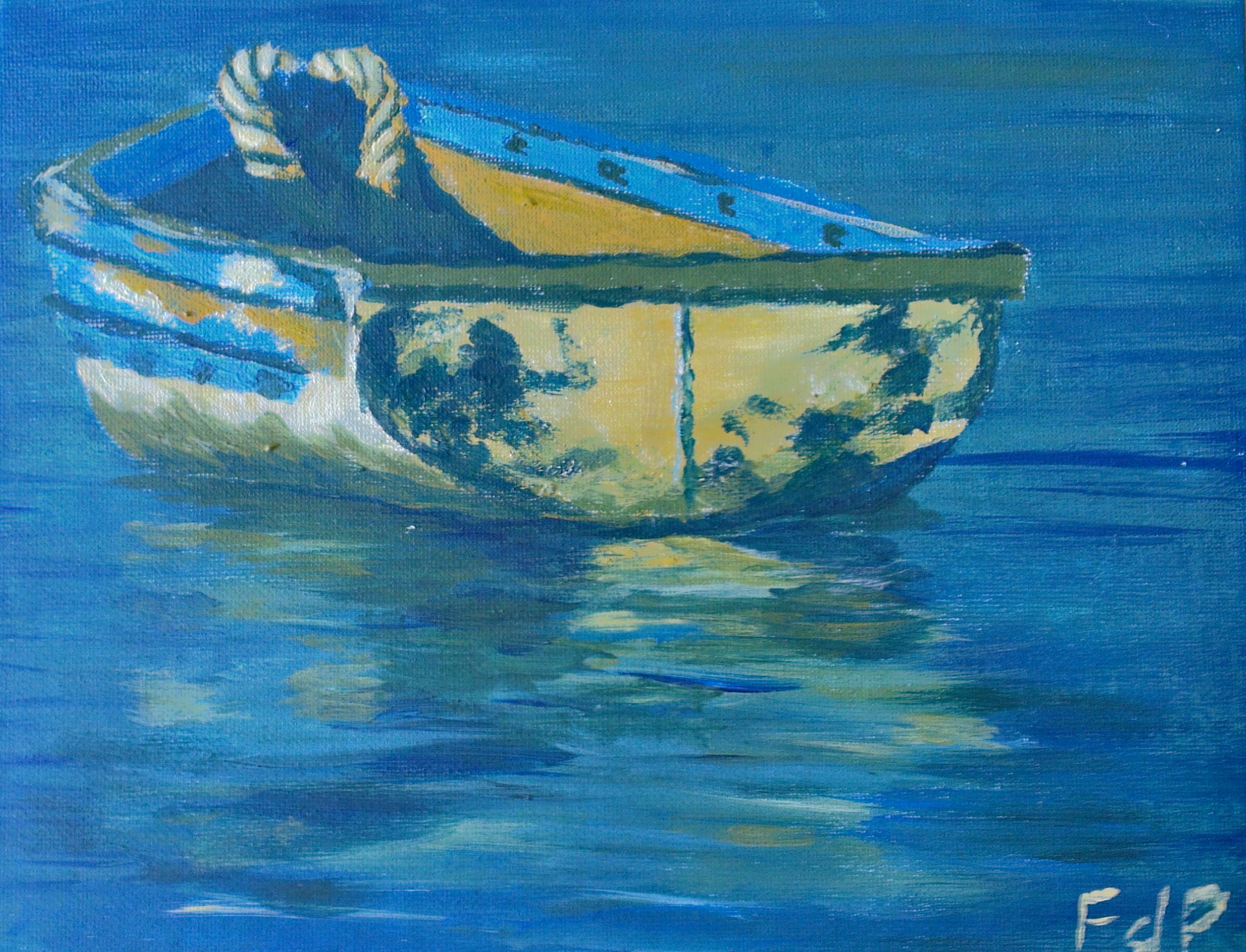
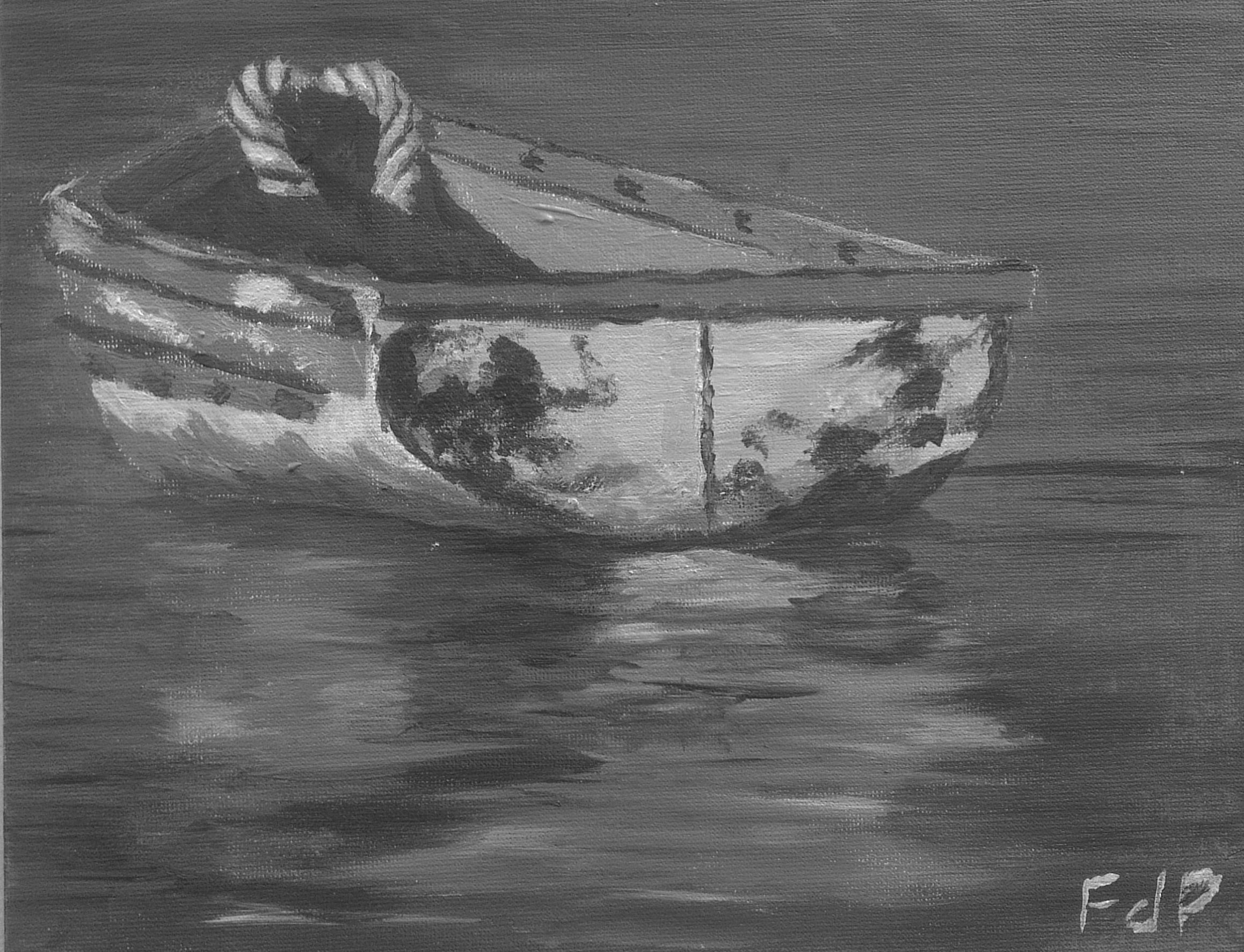
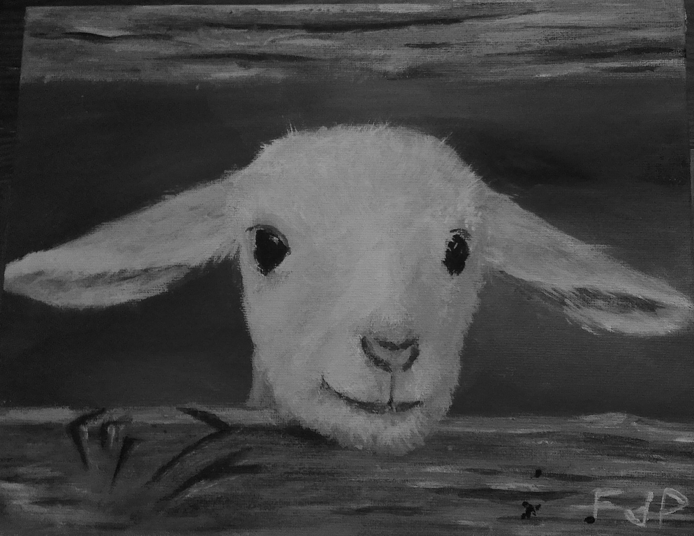
This was the first painting that I did that I felt was really lifelike, even if being done with a limited palette.  The values feel strong (as supported by the grey-scale version of the photo) and the lights feel really life-like.  The photo does not tell the true story since the colour is washed out in the photo, but something in this story “just works”.  I think it is the movement in the water and the light on the rope that is making the painting believable.

I start to get the impression that I am better at painting “dead things” than “living things”.

The Lamb

While still busy with my course in colour and value, I performed the following study, which is actually more of a painting that just a study. The original photo of the lamb is presented below.

Original photo of the lamb.

Original photo of the lamb.

In this painting/study I tried to work with two components, being a limited palette and the the correct value structure (refer to my previous post). For the palette I worked with black and white and then with raw sienna and ultramarine as the primary colours (considering black and white as shades and not colours). A touch of vibrant red was added to create the pink in the nose and ears.

I tried to plan my painting ahead of time by identifying the values needed for each area of the painting. I identified the following values before I started:

  • Brown/white combination for the wood with values 1,2,3 and 8 on the value scale.
  • Grey in the background with values 1,2 and 6
  • Black for the eyes
  • Pinkish greyscale with values of 2,3,6 and 9 for the lamb

I had to adjust the values somewhat while painting, but I was very close to where I started.  Here is my final painting:

Final lamb painting.

Final lamb painting.

As mentioned in my previous post, it is suggested that the values in the painting should be visible when evaluating a grayscale version of it.  I have included the grayscale version below.  The values used really comes to the front and does portray good use of the values, although I still feel like the face of the lamb is somewhat “flat” and that the values could have been used better.  The shape of the head is also not as I would have liked it.

Black and white version of the lamb.

Black and white version of the lamb.

Venturing into tone, value and colour

I recently came across some of the excellent courses of Richard Robinson (http://www.livepaintinglessons.com/) on landscape painting and while viewing his “Landscape Masterclass” course, realized that there are some components of this course that I did not understand. I subsequently bought his course “Mastering Color” (“color” being spelled wrong, off course…) and have been working through that for the last 2 weeks. It addresses all aspects of colour, tone and value and is highly recommended for anyone interested in taking their painting a step further. The essence of the course lies in the principle that just putting colours together could result in a good picture with a realistic appearance, but that the true quality of the painting will lie in the correct use of value – the dark and light components in an image. It is much more complex, but a simplified first step suggested by Robinson is to make use of a value-scale such as presented below to judge the values in a painting and then only make use of those values (the discrete colours) while painting. One can think of it as converting a photograph of your painting to gray-scale and evaluating that to determine the values in the painting. A good painting with inherent value should then still make sense (have meaning) with the colours reduced to grey-scales.

Greyscale

As first pass, I tried to paint the following grey-scale photo using the grey value-scale.

Reference photo for grey value-scale study of the sheep.

Reference photo for grey value-scale study of the sheep.

I did this study in very poor light since we were in De Rust in December with temperatures of around 40 degrees Celsius. The poor lighting resulted from me working inside with drawn curtains. I tried to work on a couple of things with the two main aspects being the use of the 9 values on the value-scale and trying to paint realistic grass. The painting below presents my efforts. I did not work too much on the realism of the sheep, but I do feel that the shadows are realistic, the use of the value-scale was accomplished to some degree and finally that the grass were painted with a high level of realism. I realized that the grasses must be painted with at least 3 but maybe even with 4 values of grey.  The darkest value represents the roots and the lightest value the highlights of the sun on the grasses.

Flock of sheep greyscale study.

Flock of sheep greyscale study.

The photo of my painting was taken in the evening, so it does not really reflect the true painting. A great study in the end and one through which much was learned. One of the most important lessons learned was the value contained in performing a study.

Number 7 – Fish eagle

Being on a roll, I decided to venture into another area, this time that of painting birds. I am struggling to get the depth of colour that is portrayed on the painting into the photo, so apologies for that.

7 - Visarend

The painting is based on a painting by Phil Owens taken in 2010 at the Mabalingwe Game Reserve. This was really difficult to do since, for some or other reason, the reflection of light off the feathers is not as I expected it to be. I struggled to get depth into the painting and it still feels somewhat 2-dimensional to me. I am not sure what to do to make it more life-like.

I think the water lilies are realistic and presents an aspect of depth and colour into the painting that contrasts the eagle.

I am not sure that eagles/birds is my thing…

Please comment.

Number 6 – The Girl on the Beach

My latest painting was painting for my wife. The image is presented below and consists of a girl picking up sea-shells. For this painting the sky, the waves, the beach, the shells, her hair, her clothes and the had were all quite challenging. I guess that I am trying to say that it was quite a challenging painting, but I feel that I did capture the essence and that most of the elements jells together. It is interesting that the hat forms such a focal point that draws your eye. I once again learnt that it was the deep contracts that gives depth and definition to the painting.

6 - Dogtertjie op strand

I am open for comments and suggestions.

Number 5 – The Bushveld

Sometime earlier this year (2013) I started to work on a (you guessed it) rather ambitious work to paint a bushveld scene. I stopped while still busy with the background. I restarted the painting last week and the result is presented here. The process of taking the photograph of the painting washed out some of the colours, so the photo appears quite dull.

5 - Bosveld

I am reasonably satisfied with the painting, although I think that the sky could have been a little smoother, I recently learnt a trick to sort this out. I think I managed with the brush, the trees and the grass. It was quite challenging, but I feel confident of trying it again.

Please feel free to comment.

Digital art

So following my 4th painting, I stopped painting for more than 2 years. The desire to start painting came over me recently and I decided to look into using my iPad and a stylus to start sketching and explore the world of digital art. After fiddling with a couple of programs I came across Procreate. It is a brilliant app with PhotoShop-like capabilities.

Using ProCreate, I started to work on my first digital paintings. The first successful one is presented here as “The Flame”. It is effectively a study into the use of colour to bring a vivid flame to life. I think I was quite successful in accomplishing what I set out to do, but the colour faded when I converted it from ProCreate to png format. The reflection off the candle is not quite there, but the flame looks like its really burning.

The Flame

The second rather successful digital painting was “The Lake”, which is presented below. The lines on the hills on the right is to dark and I should have changed that, but apart from that I think I achieved the “close to photorealism” that I set out to achieve.

The Lake

There are two key aspects present in digital art that makes it a very attractive option over traditional painting. These are the ability to use layers and the undo tool. Both of these are empowering tools and give you the freedom to experiment and you want to without ruining your painting.

One other tools that I recently started to use was Pinterest. My wife and kids pin for the sake of pinning, but I have found a place where I can get new ideas for painting. My boards are collections of photos for paintings that I can visit at any given time to directly paint from or to use to compose a new painting.

Number 4 – The Leopard

For my fourth painting I ventured into the unknown with complexity beyond my experience. It was completed in March 2011. I have always been fascinated by leopards and for this painting I used an award-winning (I don’t have the exact reference…) photo of a leopard as the starting point. Unfortunately the photo presented here does not do justice to the painting as the depth of colour disappears when converted to the photograph.

4 - Luiperd

I think the head and neck came out rather nicely, but the painting appears somewhat “flat” in that it lacks contrast. The spots was quite difficult to do and I think I managed OK, but I was probably scared of messing up the spots by adding the darker and lighter colours that would have given the painting greater depth. I feel OK about the painting, but I have a somewhat “incomplete” feeling about the painting and consider to work on it some more at some point.

Number 3 – The Buffalo

For my third painting I took on a rather ambitious topic (again!) given that it was only my third painting. I decided to paint this strange scene of a buffalo that is sneezing. I painted it in 2011 and it took me just 3 hours to complete!

3 - Buffel

This painting once again contains strong contrasts (seemingly something that is characteristic of my paintings). There are strong points of symmetry and asymmetry in some cases, both which are good. I feel that the head of the buffalo came out OK, but that the background was lacking in something. The whole scene was somewhat fuzzy, which is not bad in itself, although I probably intended it to be a little more crisp. I added the grass in the bottom, but that appears a little amateurish. I would have done that differently were I to repeat the painting.

Number 2 – The ladder

My second painting was based on a photo from a magazine which my wife suggested. This painting was also completed in 2010. It was perhaps ambitious (something that I tend to do), but it turned out quite nicely. For a lot of reasons I still consider it to be my best painting to date.

2 - Trapleer

The strong points of this painting are the reflection of the light off the various objects and the darkness/shadows that plays such a dominant role. I think I really succeeded in bring depth into the picture with the little pot on the middle shelf being the best indication of role that the depth and shadows play in the painting. After completing the painting it looked nice, but dull. I realised that something was missing and that is where I decided to add the red flowers in the front… and it just worked! It was as if the flowers brought the painting to life.

The weak point of the painting is the leaves of the ivy. It lacks detail and sometimes appears like blobs of green, but since the other features are so strong, you do not really take notice of the ivy.

This painting was not too difficult, but hugely satisfying to paint.