Impressionic waterfall

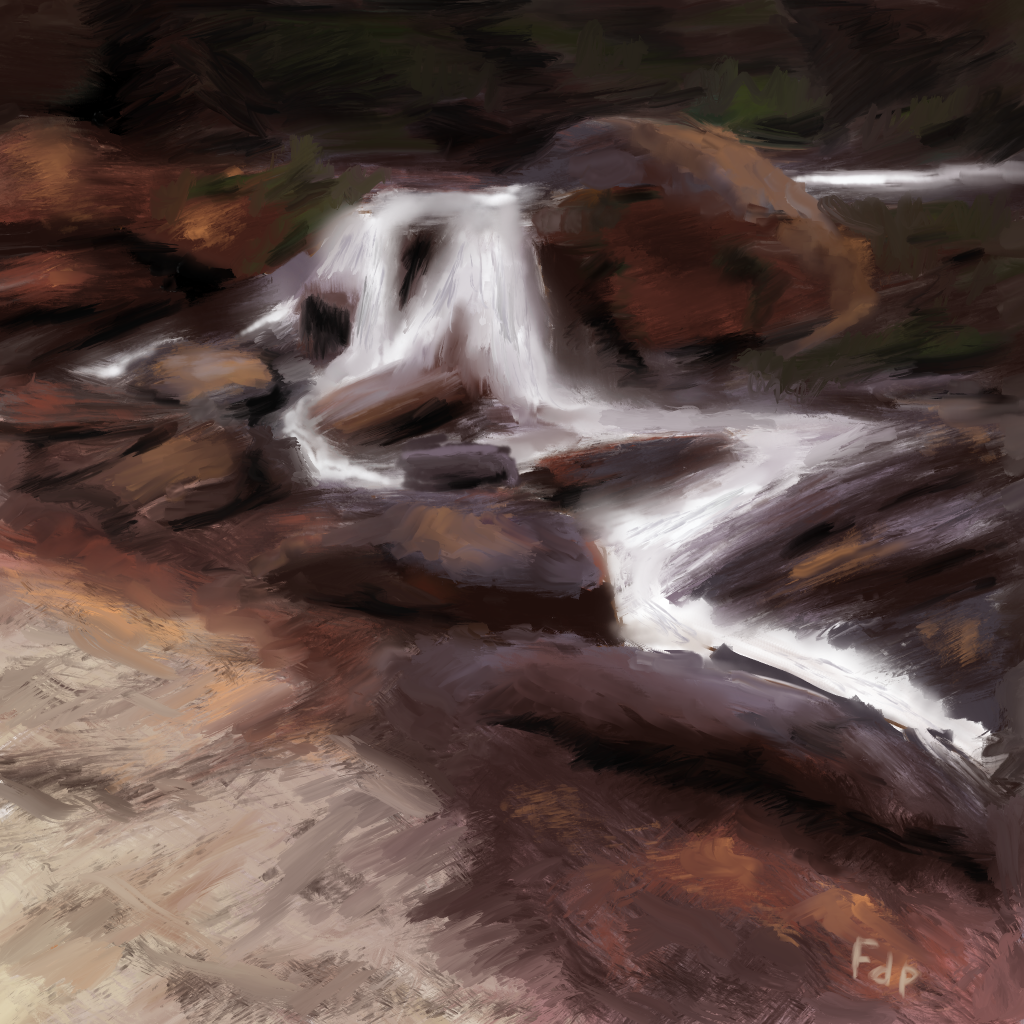
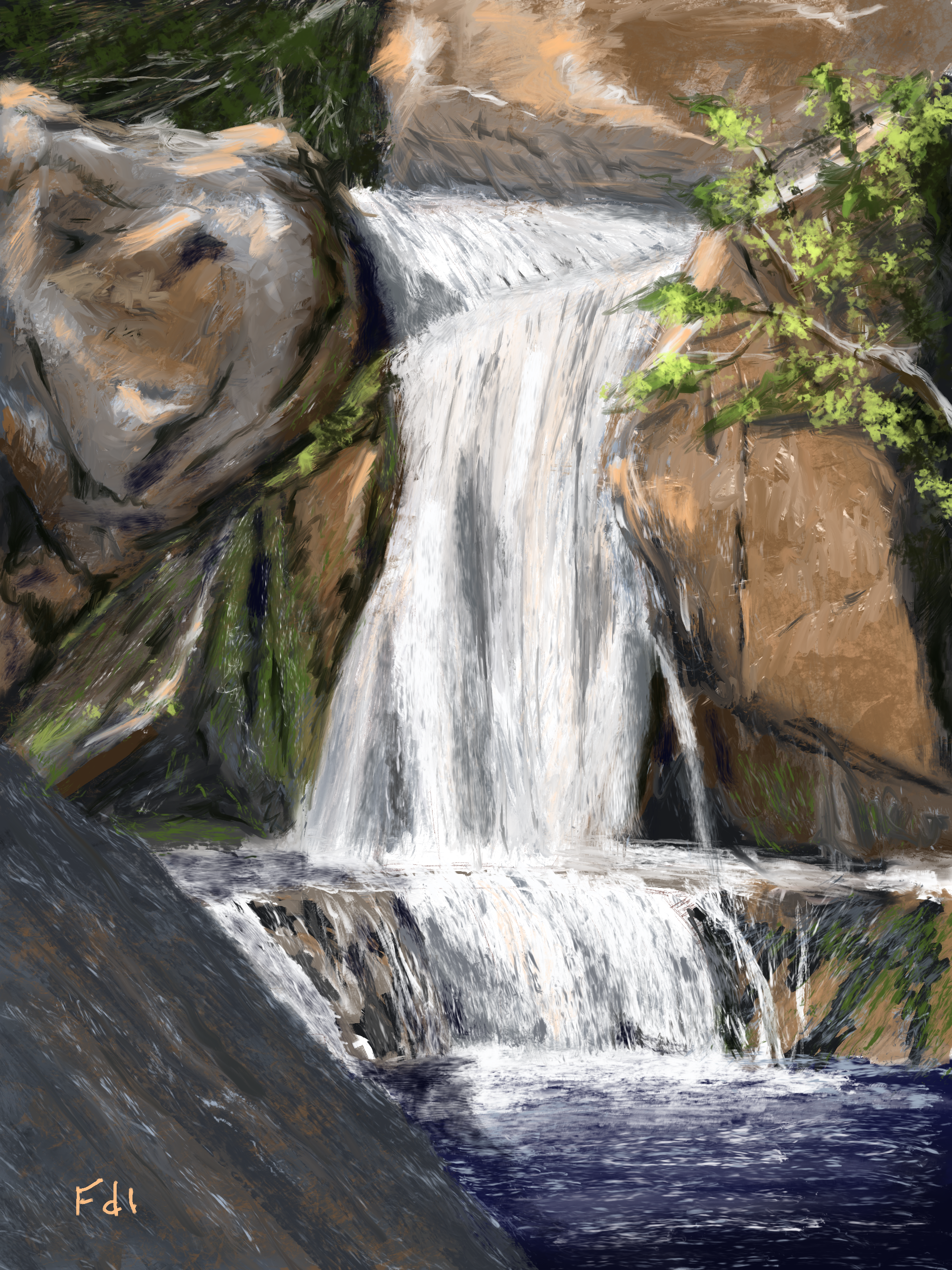
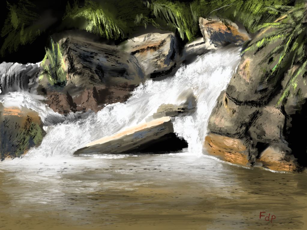
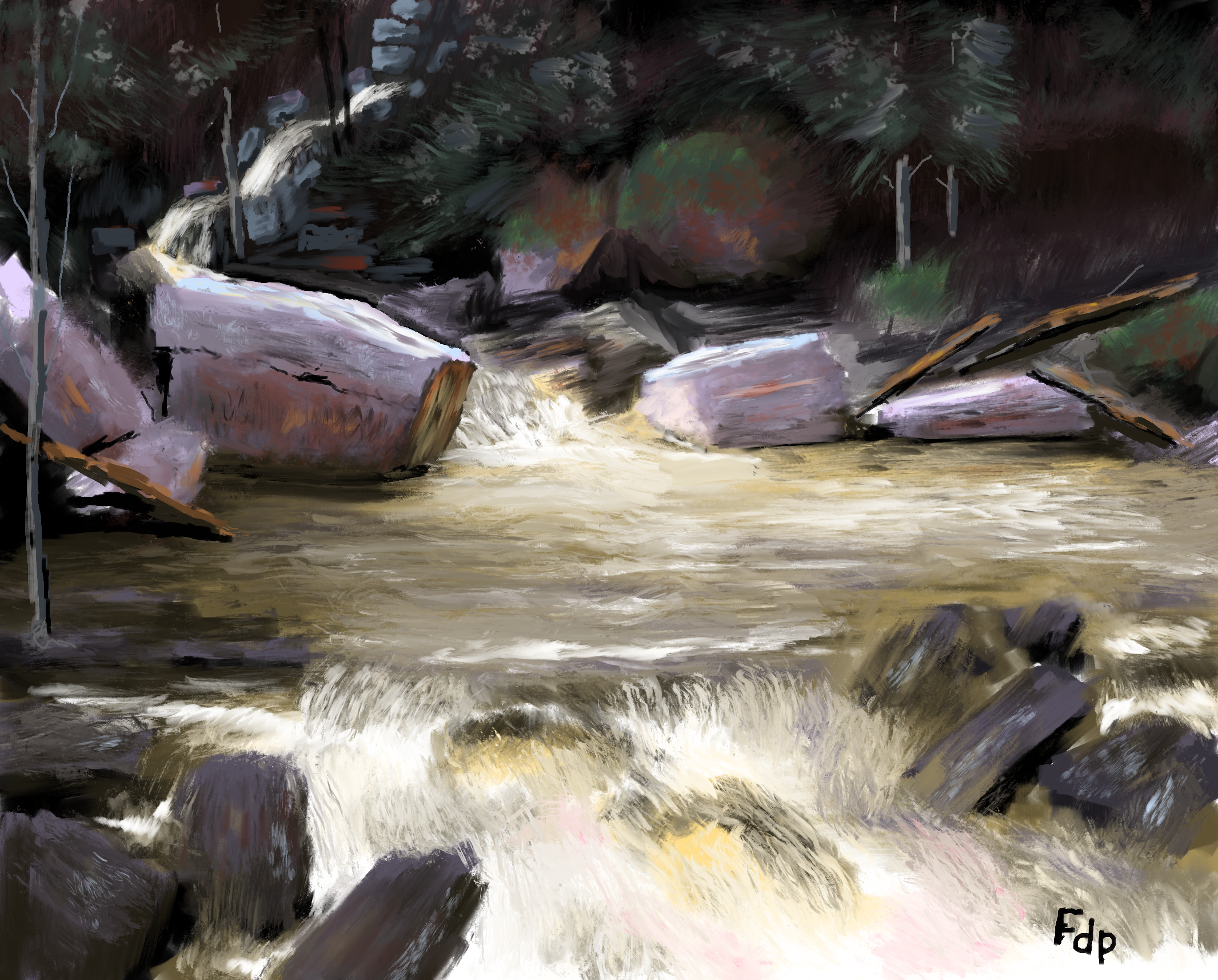
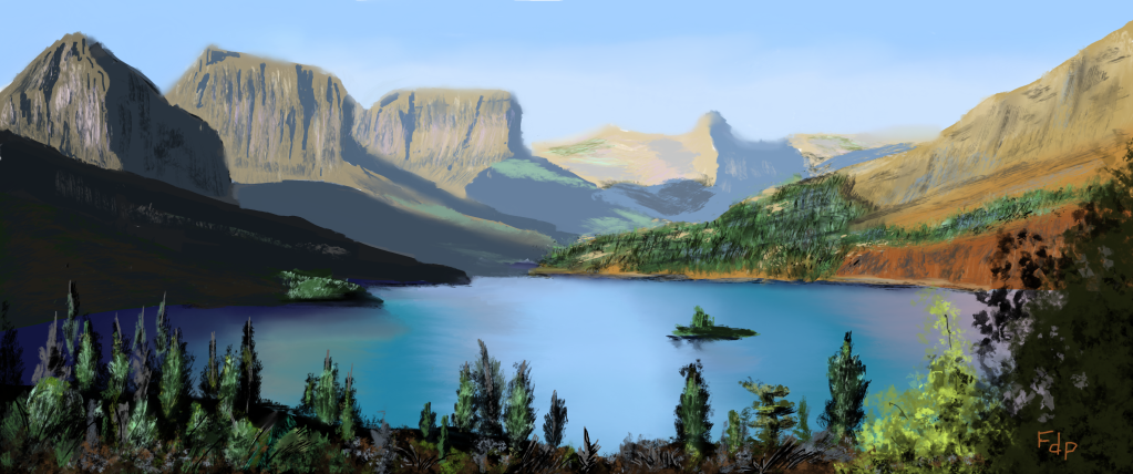
I recently revisit the artwork of Tibor Nagy on Pinterest. He has a very interesting impressionistic style where the whole painting is out of focus, with the key focal point being given a certain amount of focus. I like it. The style speaks to me. I therefore tried to copy his style by copying one of his paintings. The result is presented below. I did not achieve his level of impressionism, but I did go more loose than my usual painting style. Overall the result is satisfactory… I can hear the water roar!

Tibor Nagy’s waterfall

Waterfall

My large screen iPad Pro with Apple Pencil is a real blessing! I use ProCreate to digitally paint on the almost almost canvas size display. I paint from reference images and usually start off using a split screen before I would go over to casting the image onto the TV or computer screens.

I am not 100% satisfied with this attempt, but decided to still post it. It is as if it appears “chalky” rather than “oily”. I aim to make all my digital paintings appear like oil paintings. I do not follow a special digital technique on ProCreate, but try to paint in the exact same style as I would using oil. For example, I do not use layers. There is off course some differences, but I try to stay as close as possible to my oil technique to avoid “brush confusion” when I switch over to oil.

Back to the painting: I found the image on Pinterest. I am reasonably satisfied with it as I can hear the waterfall roar!

Rapids and rocks

Since I grew up in the mountains in the Western Cape of South Africa (not too far from Cape Town), I have an obsession with mountains, rapids, rocks and rockpools. The last while I have spent more and more time painting these topics. Here is one I did today using a photo I found on Pinterest as reference on my iPad Pro and ProCreate. I am quite satisfied with the result.

Value-based study and tutorial

This image below is a simple picture drawn using 9 values of the same colour. I wanted to show how easy it is to obtain atmospheric perspective by just painting using colour values. I completed a video tutorial on this topic mostly for application to digital art, which is here. Make sure you watch the totorial in HD. As indicated by Richard Robinson, the value-based painting concept is the key to successful oil painting as well. I do all my digital and oil paintings using the value-based colour concept. I bought his Mastering Colour course and it unlocked all the secrets of effective colour use and the value-based painting strategy to me.

Rock study

I just love rocks. I grew up in the mountains and jumped from rock to rock in the river. The shadings and play of the colour values on the rocks is something that fascinates me. Here is a digital painting I made on my iPad Pro. I am trying to include the video of the painting process. Find the link here.

Note that I never use the reference image as a “stencil” but that I visually use the reference as a guideline for the painting.